

Interior Decorating Painting Ideas - With Photos
- May 6, 2025
- 10 min read
The power of paint in interior decorating is undeniable. It can transform a room, set the mood, and even influence our emotions.

But choosing the right paint color and technique can be a daunting task. With endless options and trends, it's easy to feel overwhelmed.
That's where this guide comes in. We aim to demystify the process, providing you with the latest interior decorating painting ideas.
We'll delve into color psychology, current trends, and innovative painting techniques. We'll also offer practical advice on selecting the perfect paint finish and creating harmony with color schemes.
Whether you're renovating your entire home or just refreshing a single room, this guide will equip you with the knowledge and inspiration you need.
Table of Contents:
The Power of Paint in Interior Decorating
Paint can dramatically change the look and feel of your space.
The right color can evoke emotions, set the tone, and enhance the overall aesthetic of your home.
Moreover, paint is one of the most cost-effective ways to transform a room. With the right techniques, a simple paint job can elevate any interior.

Beyond aesthetics, the strategic use of paint can even alter the perceived dimensions of a room. Colors can make small spaces feel larger and large areas more intimate.
Ultimately, paint gives you the freedom to express your personality, align with trends, or create a timeless backdrop. Its power in interior decorating is truly transformative.
Understanding Color Psychology
Color psychology plays a pivotal role in interior design. Different hues can influence our emotions in various ways.

For instance, blues often promote calmness and tranquility, ideal for bedrooms or bathrooms. Conversely, yellows and oranges can energize, making them great for kitchens or exercise rooms.
Understanding these effects is crucial when selecting paint colors. It helps you choose shades that align with the intended mood of each space.
By tapping into color psychology, you ensure your home is not only beautiful but also emotionally harmonious.
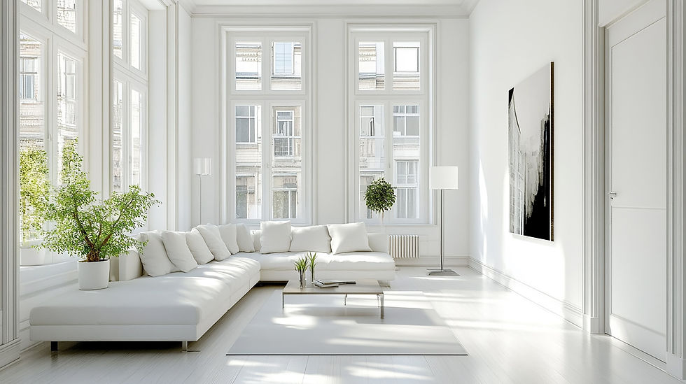
Current 2025 Color Trends to Refresh Your Home
Staying on top of color trends can revitalize your home decor. This year, several hues are making a splash in interior design.

Bold, dark colors like the image we featured at the top are gaining popularity for their dramatic flair. They add depth and elegance to any space.
Pastel hues are also trending, providing a soft and soothing ambiance. These tones are perfect for creating a relaxed atmosphere.
Here's a snapshot of current color trends:
Bold and dark shades for drama
Soothing pastel tones for calmness
Earthy, natural palettes for warmth
Vibrant, playful colors for liveliness
Incorporating these colors keeps your space fresh and in vogue. Yet, it's crucial to balance trends with personal style for a truly unique home.

Maximizing Space with Paint
Paint is an excellent tool for optimizing space perception in your home. Strategic color use can make rooms appear larger or more intimate. Light colors, such as soft whites and pastels, can open up a space, creating the illusion of more room.
Conversely, darker hues like deep blues and rich greens can cozy up a large area, making it feel more welcoming. Employing color tricks effectively in your home can revolutionize how you perceive the available space.

Making Rooms Feel Larger or Cozier
To make a room feel larger, opt for light, neutral paint shades. These colors reflect more light, enhancing natural brightness.
For ceilings, a lighter shade than the walls can add height, giving the impression of a more expansive space. Using white on trims and baseboards will also stretch the walls vertically.
For a cozier ambiance, dark or warm tones, such as terracotta or navy, can add depth. These colors absorb light, drawing the walls in, which creates a comforting and intimate feel.

The Art of Accent Walls
Accent walls are a fantastic way to introduce bold colors without overwhelming a space. They add depth, draw the eye, and create a focal point.
Choosing the right wall for an accent is key. It should be one that naturally draws attention, like a fireplace wall or the wall behind a bed.

For a dramatic effect, darker shades work well against lighter surroundings. This contrast defines the space while highlighting architectural features.
Accent walls also allow for creativity with patterns or textures. Consider geometric designs or a textured paint finish for added interest. The versatility of accent walls makes them an excellent option for personalized interior decorating.

Selecting the Perfect Paint Finish
The paint finish you choose significantly impacts the room's look and feel. Each finish offers unique qualities, affecting durability and maintenance.

Matte finishes, for instance, provide a soft, velvety appearance but may not withstand heavy cleaning. In contrast, high-gloss paints, while reflective and modern, highlight imperfections.
Selecting the right finish depends on your room's function and traffic level. It's essential to match the finish with your lifestyle needs for a balance of aesthetics and practicality.
If you're unsure about completing your project with precision and professionalism, consider reaching out to an experienced painter.
Room by Room: Best Finishes for Functionality
In high-traffic areas like kitchens or hallways, satin or semi-gloss finishes are ideal. These finishes are durable and easy to clean, suiting spaces prone to spills and smudges.

For living rooms and bedrooms, an eggshell finish provides a smooth surface with a slight sheen, offering a modern yet cozy feel. It’s an excellent choice for walls that see moderate activity.
In bathrooms, where moisture resistance is crucial, a satin or semi-gloss finish works best. These finishes protect walls from humidity while allowing for easy wipe-downs.
Ultimately, choosing the right finish involves considering the room's use and desired aesthetic. It's about finding harmony between form and function to create an environment that suits your needs.
Creating Harmony with Color Schemes
Achieving harmony in your home begins with a thoughtful color scheme. A well-planned palette ties spaces together, creating continuity throughout.
Start by choosing a base color that complements your overall decor style. This foundational hue sets the tone and mood of your home.
Next, incorporate coordinating colors using the 60-30-10 rule. This rule involves using the primary color for 60% of the space, a secondary color for 30%, and an accent color for the remaining 10%.

The goal is to create a balanced look that feels cohesive yet dynamic. Carefully selected colors can enhance the beauty of your home while reflecting your personal style.
Pairing Paint with Furniture and Decor
Paint colors should complement your furniture and decor, enhancing the overall aesthetic. Consider the color and style of key pieces when selecting wall paint.
Neutral tones like beige or gray offer a versatile backdrop for bold furnishings. These classic shades highlight vibrant artwork or colorful decor elements.
Alternatively, use bold wall colors to accentuate neutral furniture. A daring shade can add drama and personality to an otherwise understated room.

Balance is key when pairing paint with decor. The right combination showcases your possessions, making your space feel inviting and well-designed.
Innovative Painting Techniques and Effects
Innovative painting techniques can transform even the most ordinary space into something extraordinary. Consider techniques like sponging or rag rolling to add texture and depth to your walls. These methods create subtle variations that catch the eye and provide visual interest.
Another exciting option is using stencils to introduce intricate patterns or motifs. Stencils offer precision and variety, perfect for adding custom flair to your decor. Whether you choose bold or subtle designs, these techniques enhance the artistry of your interior spaces.
Finally, consider experimenting with metallic or pearlescent finishes. These add a shimmering effect, enhancing the light and transforming the ambiance of your room effortlessly.
Color Blocking and Geometric Designs
Color blocking involves using contrasting colors in large sections, creating a bold, modern statement. This technique works well on feature walls or for defining separate zones in open-plan spaces.

Geometric designs offer a creative twist, bringing dynamic energy into a room. They can feature sharp angles, stripes, or even abstract patterns. These designs work particularly well in contemporary settings, offering a fresh and innovative aesthetic.
Using painter's tape for clean lines is essential. This ensures precise, professional-looking results. By employing these methods, you can create striking visual impact that transforms your space with minimal effort.
Finally, color blocking and geometric designs are versatile. They can be adapted to any color palette or style, offering endless possibilities for personalization.
Highlighting Architecture and Hiding Flaws
Paint can be a powerful tool for showcasing architectural features like moldings or ceiling beams. Consider using a contrasting color to highlight these details, drawing attention to your home's unique character.

For rooms with less-than-perfect surfaces, clever paint choices can disguise imperfections. Matte finishes help hide bumps or cracks, offering a smooth, uniform appearance.
Employing techniques like a gradient or ombre effect can divert attention from flaws. These create focal points that guide the eye naturally towards the best parts of a room.
Ultimately, using paint to both accentuate and camouflage can refine a space. This approach maximizes your home's aesthetic potential while addressing practical challenges.
The Role of Lighting in Paint Perception
Lighting profoundly influences how paint colors appear. A color that looks perfect under one light can change completely under another. Therefore, understanding this effect is crucial when selecting paint for your home.
Natural light shifts throughout the day, altering the mood and perception of colors. It's essential to consider how your space receives light at various times. In contrast, artificial lighting remains constant, but its type and strength also impact how colors are perceived.
Always test paint samples under different lighting conditions. This approach ensures your chosen color will look just right at all times.

Natural vs. Artificial Light on Colors
Natural light's dynamics can significantly change a color's appearance. Morning light is cooler, often enhancing blue and green tones. By afternoon, warm sunlight may intensify reds and yellows, altering the room's character entirely.

Artificial light varies by bulb type. Incandescent bulbs bring out warmer tones, casting a cozy ambiance ideal for living spaces. On the other hand, fluorescent lighting often highlights cool hues, useful in kitchens or work areas.
LED lighting, with its versatility, offers both warm and cool options. Test colors under each light source to ensure harmony in your environment.
Ultimately, a well-chosen paint color complements both natural and artificial light, creating balance and beauty in any space.
Eco-Friendly and Health-Conscious Painting
Eco-friendly painting emphasizes health and sustainability. Choosing sustainable paint options benefits the environment and your well-being.
Low-VOC paints release fewer harmful emissions, promoting cleaner indoor air quality. They are especially ideal for homes with children or sensitive individuals.
Furthermore, using paints with natural ingredients can further reduce health risks. Such paints are often derived from plant-based materials, making them a safer choice for conscientious homeowners.
Choosing Low-VOC Paints for Your Home
Low-VOC paints are growing in popularity due to their health benefits. They emit fewer volatile organic compounds, reducing indoor pollution. This means less harmful chemicals in the air, which is crucial for long-term health.
These paints offer durability and excellent color options, just like traditional paints. They are available in a wide range of finishes to suit any room's needs. When selecting a low-VOC paint, check labels for certification, indicating their safety.
Incorporating these paints into your home shows a commitment to sustainability. It's a choice that reflects environmental care and consideration for all household members.
Preparing for a Professional-Looking Paint Job
Achieving a flawless paint finish requires careful preparation. Begin by assessing the walls for any imperfections or damage. Smooth, clean surfaces ensure paint adheres properly.
Next, gather the right tools, such as brushes, rollers, and drop cloths. These tools will aid in achieving uniform application and protecting floors and furniture. Finally, allocate sufficient time for each step to avoid rushing the process.
Wall Prep and Priming Essentials
Proper wall preparation is key to a durable paint job. Start by cleaning the walls to remove dirt and grease. This step ensures that the paint bonds well to the surface.
Tools you need:
After cleaning, inspect for cracks or holes and repair them using a suitable filler. Smoothing these areas provides a consistent base for painting.
Priming is often an essential step, especially on new or repaired walls. Primer helps seal the surface and improves paint adhesion. Choose a primer suited to the wall material and the paint you're using.
Once primed, allow the walls to dry completely before painting. This patience ensures a smooth application and long-lasting results.
Maintaining Your Painted Spaces
A fresh coat of paint can transform your home, but maintaining it is essential for long-term appeal. Regular cleaning and careful touch-ups can extend its beauty. Be mindful of the specific maintenance needs for each room.
Avoid abrasive cleaners that can damage the paint’s surface. Instead, use a soft cloth with mild detergent. Proper care keeps walls looking vibrant and new.
For areas prone to scuffs, consider placing furniture and fittings strategically. This arrangement can help protect painted walls and minimize touch-up frequency.
Tips for Touch-Ups and Longevity
Begin by keeping leftover paint for future touch-ups. Storing it in a cool, dry place extends its shelf life. Having the original paint ensures color consistency when small repairs are needed.
For touch-ups, use quality brushes or rollers that match the original tools used. This consistency minimizes differences in texture or finish. Always test the paint in a small area before applying it broadly.
To maintain longevity, inspect walls periodically for signs of wear or fading. Address issues promptly to prevent larger problems. With attention to detail, small touch-ups blend seamlessly with the existing paint.
Lastly, consider the environmental conditions in each space. Excess humidity or sunlight can affect paint over time. Taking preventive measures, like using dehumidifiers or UV-protective window films, can prolong paint life.
Conclusion: Embrace Trends While Staying True to Your Style
Trends offer fresh inspiration, but your style must guide decisions. Explore current color trends, evaluating how they fit your unique aesthetic. This balance results in a timeless appeal.
Don't Shy Away From Interior Decorating Painting Ideas
Don't shy away from experimenting with bold colors or techniques. Trends, like accent walls, add modern flair without compromising individuality. Your home should speak to who you are.
Consider using trending hues as accents rather than main themes. This strategy allows for easy updates as trends shift. It keeps the space dynamic yet personal.
Finally, remember that your living space should comfort and inspire you. Embrace trends that resonate with your style, ensuring your home feels authentically yours. With creativity and insight, your vision becomes reality.
Disclaimer:
The colors listed and linked to Benjamin Moore's page are intended to serve as a representation of what the color could look like. We highly recommend bringing color samples to your home and applying them to your walls to see how they appear under your indoor lighting. Colors may vary depending on lighting conditions and surrounding elements.


https://fly88.free/ dạo này thấy mọi người nhắc hoài nên mình bấm vào nghía thử cho biết, chủ yếu xem giao diện với cách họ trình bày chứ không có ngồi đọc kỹ từng bài. Cảm giác đầu tiên là trang nhìn gọn, kiểu chia nội dung theo dạng bản tin nên lướt nhanh vẫn nắm được đang có gì mới. Mình có thấy họ nói khá nhiều về chuyện an toàn/bảo mật và giao dịch nạp rút nhanh, đọc qua thì câu chữ không bị rối. Mấy phần nội dung được gom theo cụm, tiêu đề to nên tìm đúng mục cũng dễ, không phải kéo mãi mới thấy. Nói chung giống một trang tin giải trí để lướt vài…
cổng game bài hitclub mình thấy bạn bè nhắc hoài nên cũng ghé thử cho biết. Mình chỉ lướt nhanh chứ không vào sâu, chủ yếu xem trang họ làm có dễ dùng không. Cảm giác đầu tiên là giao diện khá “sạch”, chia khối rõ ràng nên kéo xuống không bị rối. Có mấy đoạn giới thiệu kiểu thông tin nền tảng (mình thấy họ nhắc ra mắt từ 2015) đặt ngay phần nội dung chính nên đọc lướt cũng nắm được ý. Menu để chỗ dễ nhìn, chuyển qua lại mượt, không phải mò. Nói chung nhìn giống kiểu họ chăm chút phần trình bày hơn là nhồi nhét chữ, các tiêu đề và khung nội dung căn…
cm 88 mình thấy bạn bè nhắc hoài nên mới ghé thử cho biết, kiểu vào lướt nhanh xem trang làm ăn ra sao thôi. Vừa mở lên là thấy họ chia nội dung khá rõ, không bị rối mắt như nhiều site khác. Mình để ý nhất là phần tin tức thể thao cập nhật 24h được tách thành một khối riêng nên nhìn phát biết ngay chỗ đọc tin. Kéo xuống cũng mượt, chữ dễ đọc, khoảng cách thoáng nên không phải nheo mắt. Menu đặt ngay chỗ dễ thấy nên chuyển qua lại vài mục khá nhanh, không cần bấm vòng vòng. Nói chung cảm giác dùng ổn, nhìn gọn gàng và dễ tìm thứ mình cần,…
kqbd trực tuyến mình vào thử cho biết vì đang cần coi kết quả mấy trận trong ngày, ai ngờ nhìn cũng dễ dùng phết. Mình không có thời gian ngồi mò từng mục, chỉ lướt nhanh bảng kết quả với mấy dòng diễn biến thôi. Cái mình để ý là tỷ số với thẻ phạt cập nhật khá nhanh, kiểu đang xem mà nó nhảy số gần như theo thời gian thực nên đỡ phải F5 liên tục. Trên điện thoại cũng ổn, chữ không bị bé quá, cuộn xuống là thấy các trận xếp gọn gàng. Nói chung hợp kiểu người chỉ muốn check nhanh rồi thoát. Nhìn cái bảng thông tin dạng cột canh thẳng hàng, liếc…
fv88 nhà cái dạo này thấy nhiều người nhắc nên mình cũng ghé thử cho biết, chủ yếu xem giao diện chứ không làm gì thêm. Vào trang thấy họ trình bày khá gọn, kiểu chia nội dung thành từng khối nên kéo xuống không bị rối mắt. Có đoạn họ để mấy con số vận hành như lượng hội viên hay lượt tải app nhìn khá “thẳng thắn”, đặt ngay trong bài chứ không phải giấu ở cuối. Mình cũng thích cái menu để rõ ràng, bấm qua lại mấy mục nhanh, không phải mò lâu. Nói chung lướt vài phút là nắm được họ đang nói gì, chữ nghĩa dễ đọc. Mấy box số liệu và tiêu đề…